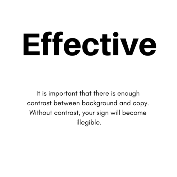
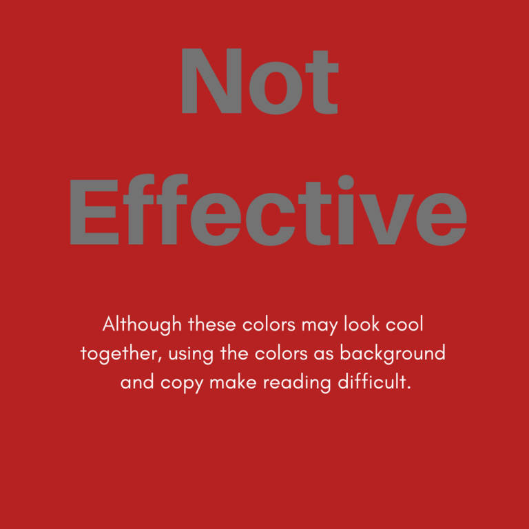
Signs are meant to be read. Without proper contrast, it becomes difficult for prospective visitors to read. When designing a legible and impactful sign, confer with your Graphic Designer on the best choices for your brand. The most effective color choices must have contrast.
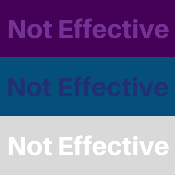
When using colors on the same color scale, it is important to ensure they have enough difference to be able to read.
Choosing a color too close to your background color will make legibility almost impossible.
Light copy on dark backgrounds are fairly easy to read from a distance and up close.
Fonts with thin outlines, openness and gradient are not good choices for signs as they are hard to read from a distance.
Have more questions on how to make an impact with your sign design? Give us a call!


